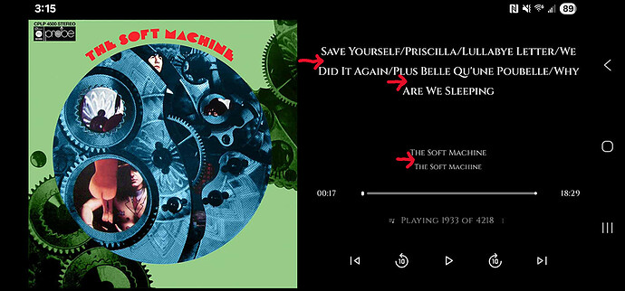
Feature description:
Hi.
I’m loving the app! Would it be possible to get less space between string lines on the Now Playing screens? I have the top and bottom margins set to 0 between track title, artist, and album title, in both Portrait and Landscape mode, but it still looks like there is an entire space between each string line, regardless of which font I use. Thanks so much!
Problem solved:
I would aesthetically prefer less space between long song title lines (when ellipsis is turned off), as well as less space between artist and album title lines.
Brought benefits:
It would take up less space and provide uniformity, allowing the potential for more information on screen.
Other application solutions:
Additional description and context:
Screenshots / Mockup:
